HNAK
Bridging the gap between online and offline shopping experiences.
Summary
HNAK recognized that their customer experience was not on par with their competitors, and that they needed to focus on the design of their services to enhance the brand experience for their consumers. They realized that even though they had loyal customers, they had overlooked the importance of design in creating a positive and seamless experience for their customers. This involved improving the usability and aesthetics of their services, and adding features, functionality that customers value. The goal would be to create a customer experience that differentiates HNAK from its competitors and builds loyalty among its customer base.
Role
Project lead
User Experience (UX) Researcher
Interaction (IxD) Designer
User Experience (UX) Designer
User Interface (UI) Designer
Timeline
3 months
skills
Product thinking
UX audit
Interaction design
Market researcher
Visual design
tools
Figma
Miro
Notion
Photoshop
*Note
*This case study covers only parts of several months of design process focusing mainly on my role within the project. I have retracted or changed portions of findings to conceal any confidential information.
about HNAK
HNAK, E-commerce: the retail haven for global brands and local talents.
HNAK is the e-commerce branch of Al Musbah group, one of the leading retail companies in Saudi Arabia - with 190+ stores across the middle east region. HNAK is positioned to shift that focus by being the home of top international brands while actively telescoping and supporting local trends and talents.
Project objective
Seamless experience
Ensure a smooth and seamless user experience across the entire platform.
UX audit
For HNAK, we conducted a thorough UX audit and heuristic evaluation to identify opportunities for improvement on their website. This included reviewing analytical data, defining user archetypes, and enhancing navigation and user flows on every page of the site.
Prior to our work, HNAK had not had the opportunity to apply this process. As a result of our efforts, we were able to boost the performance of the website and provide a better user experience for visitors.
Preference for local brands and products.
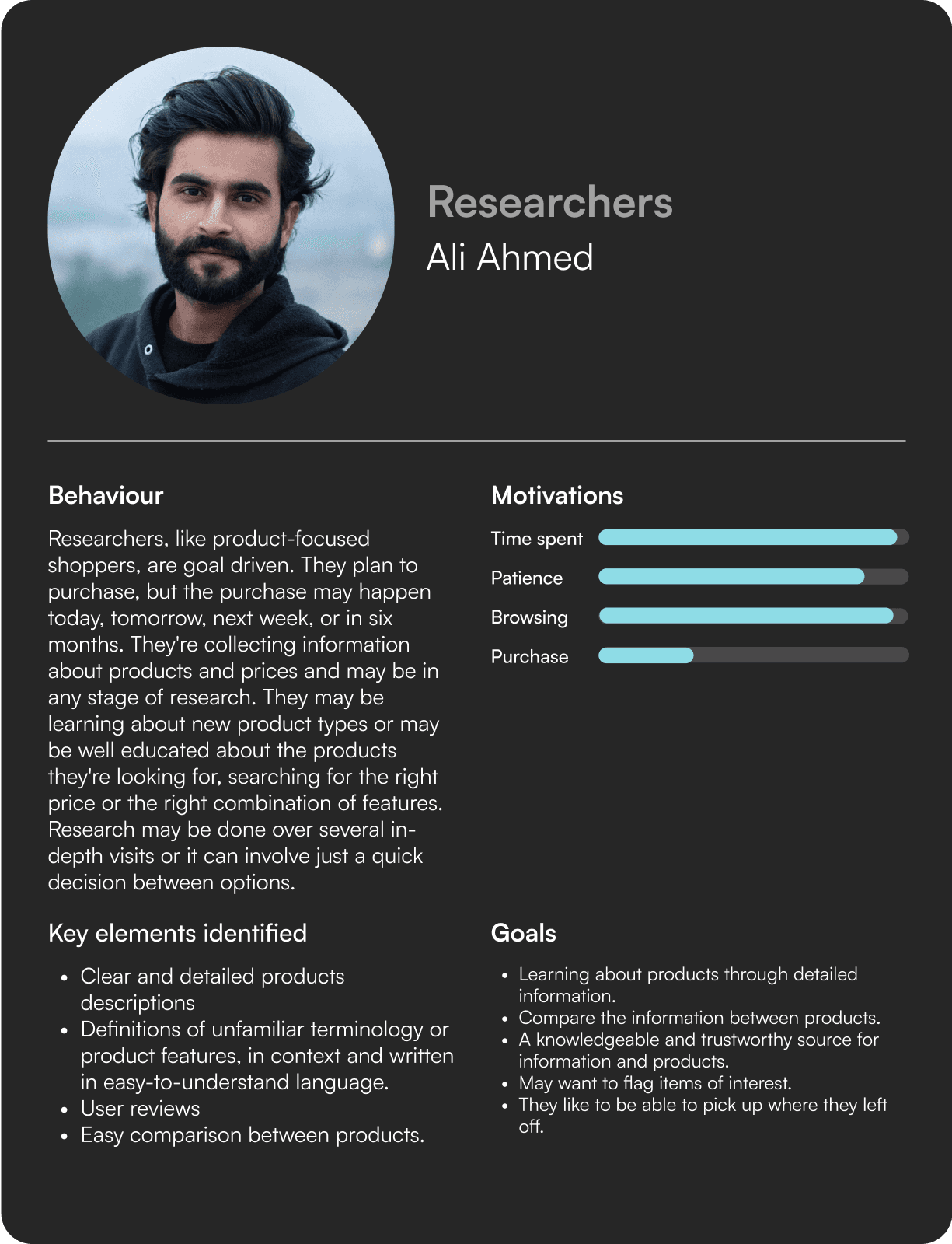
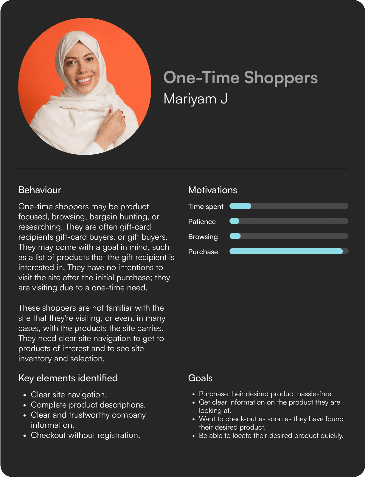
The 4 user archetypes.
In-store experience is still valuable.
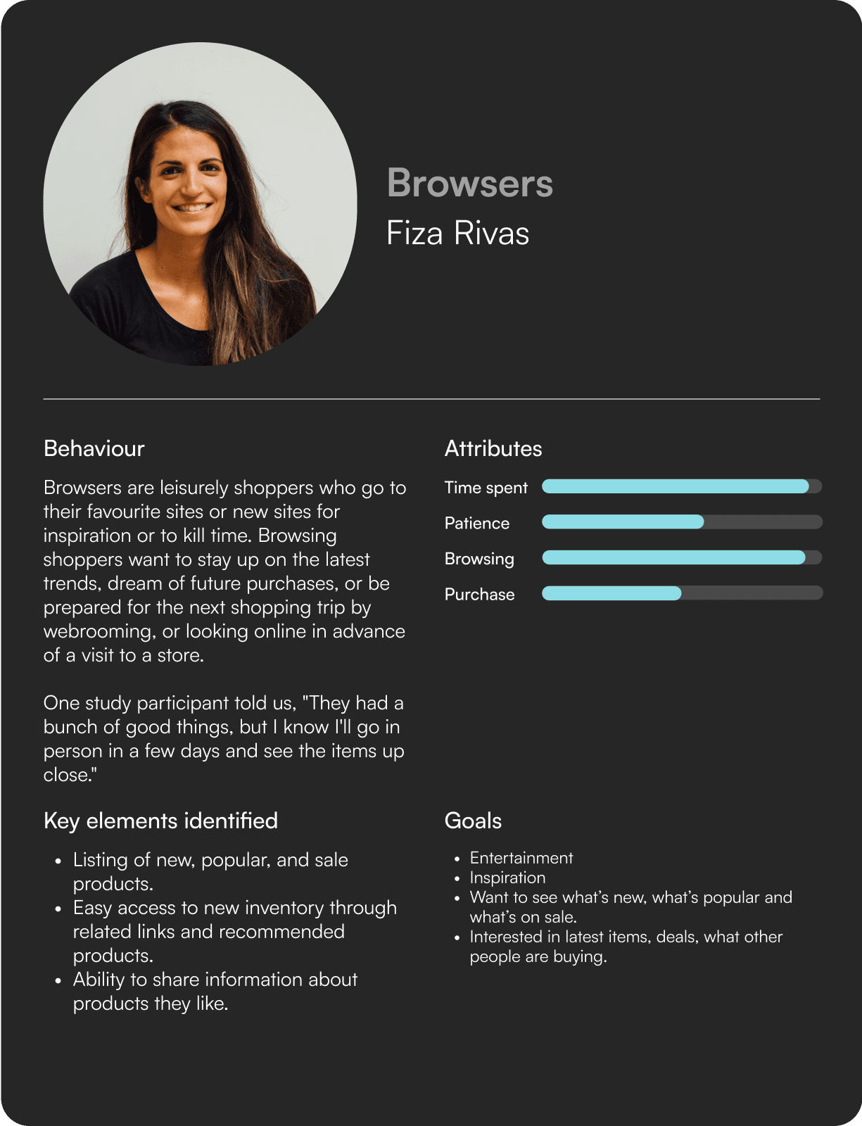

Persona Mapping
During the research phase, we delved into existing user behaviors and journeys. This exploration led us to identify four distinct user personas, each aligned with various touchpoints and exhibiting distinct behaviors.
This insight guided us in designing the platform with each persona in mind.
project goal
How can we differentiate the HNAK platform and ensure a seamless experience for all users?
crafting Wireframes
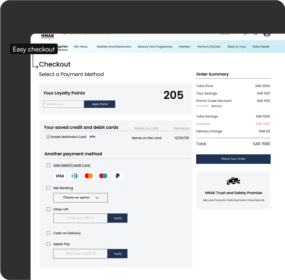
In crafting our wireframes, we meticulously aligned with the personas meticulously developed earlier. By incorporating key characteristics and preferences unique to each persona, we ensured a user-centric design. This approach facilitated the integration of features tailored to address specific needs, resulting in an intuitive and personalized user experience.

Final overview
Our team took a thorough and comprehensive approach to creating the new website for HNAK. By conducting data-backed research and collaborating across teams, we were able to create a more holistic design that took into account the needs of all user archetypes.
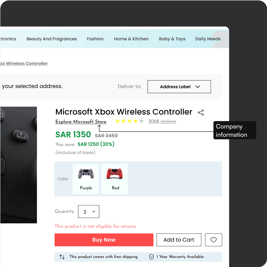
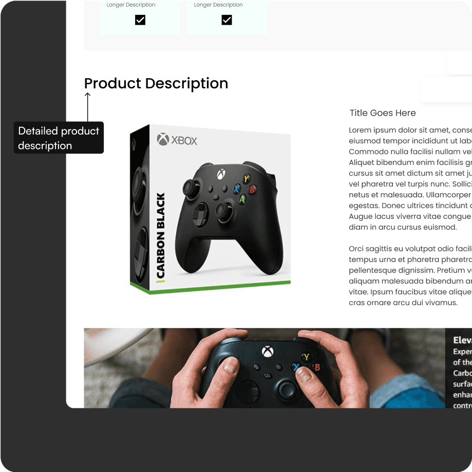
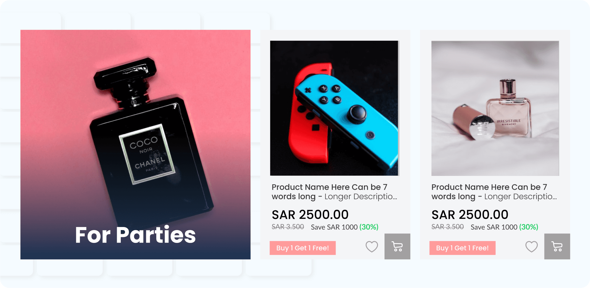
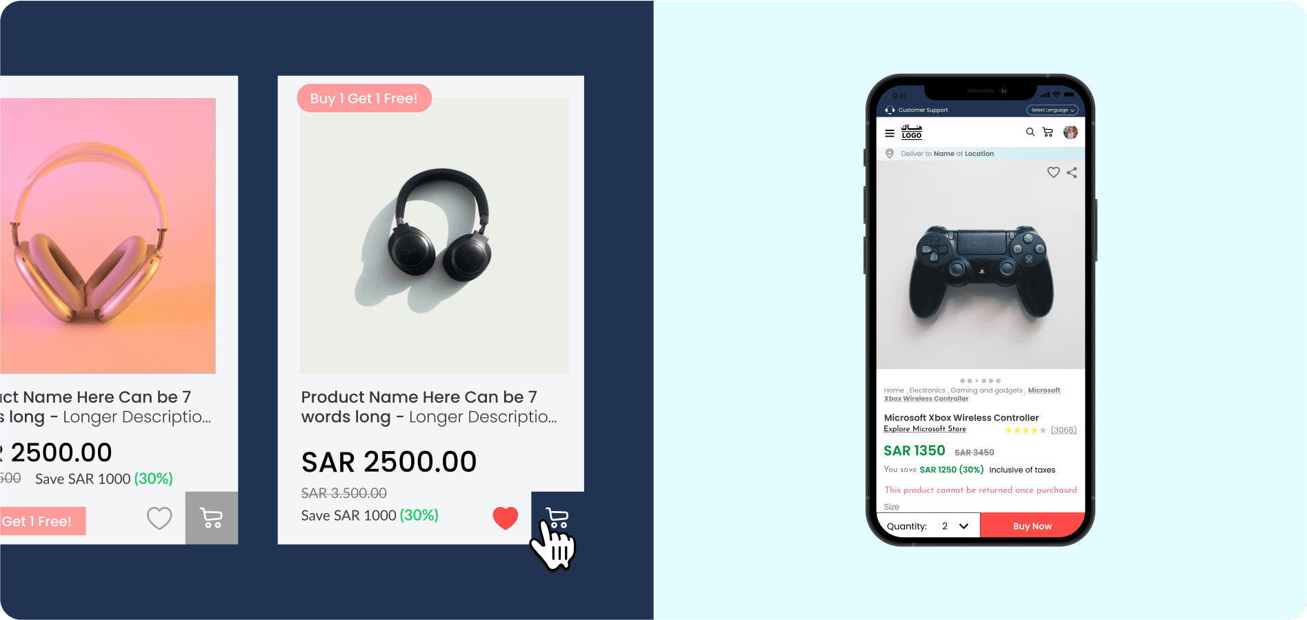
We created over 50 pages and 100 unique visuals to improve communication of product features, descriptions and added testimonials and ratings to support the users needs. We optimised all the major flows to make sure that it caters to all the user archetypes.
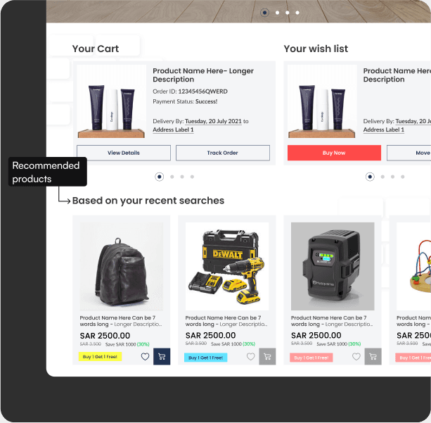
for Browsers
Considerations in building this
Listing of new, popular, and on sale products.
Easy access to new inventory through related links and recommended products.
Ability to share information about products they like.
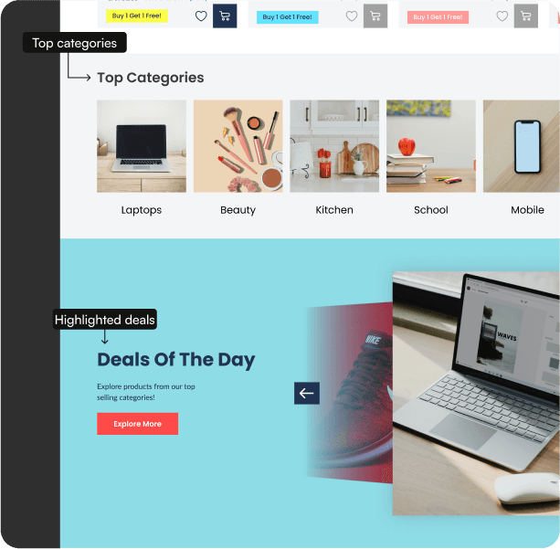
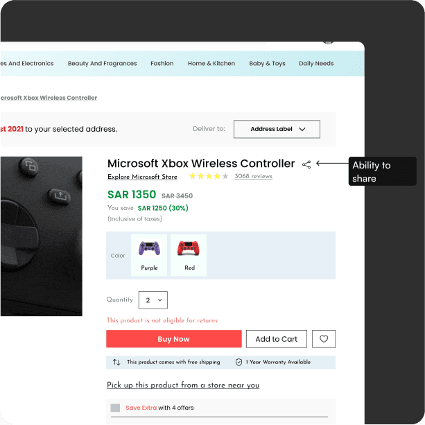
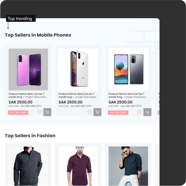
for researchers
Considerations in building this
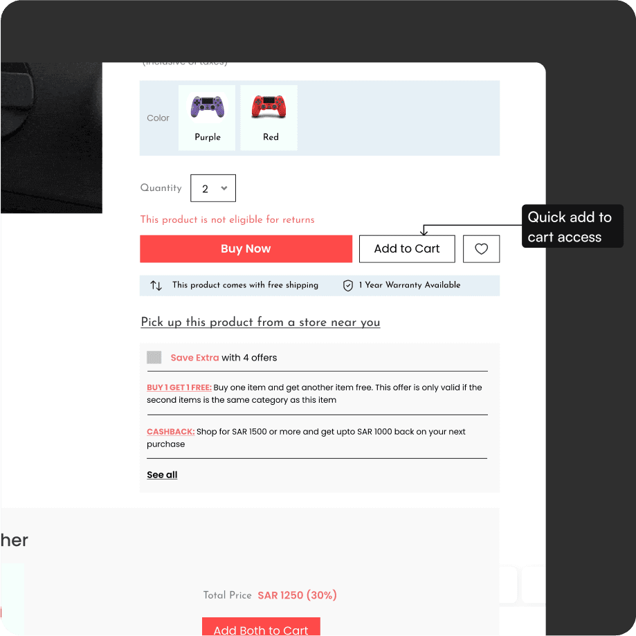
Clear and detailed products descriptions
Definitions of unfamiliar terminology or product features, in context and written in easy-to-understand language.
User reviews.
Easy comparison between products.
Easy to add to cart.

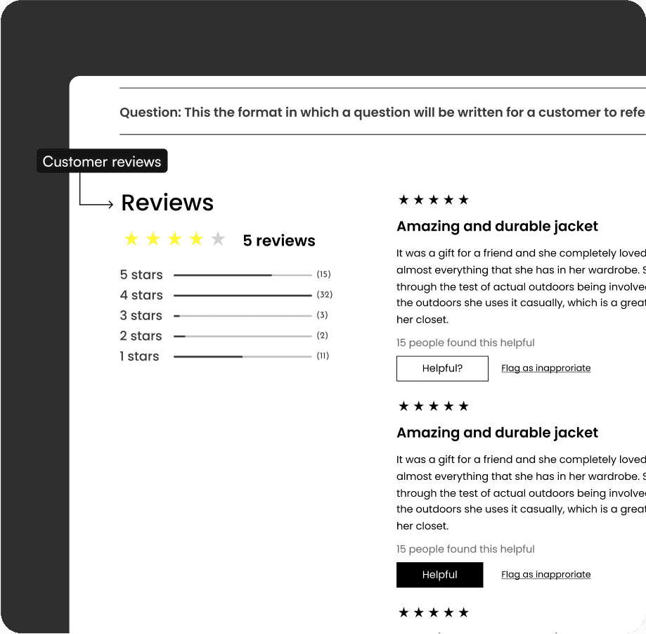

for Product Focused
Considerations in building this
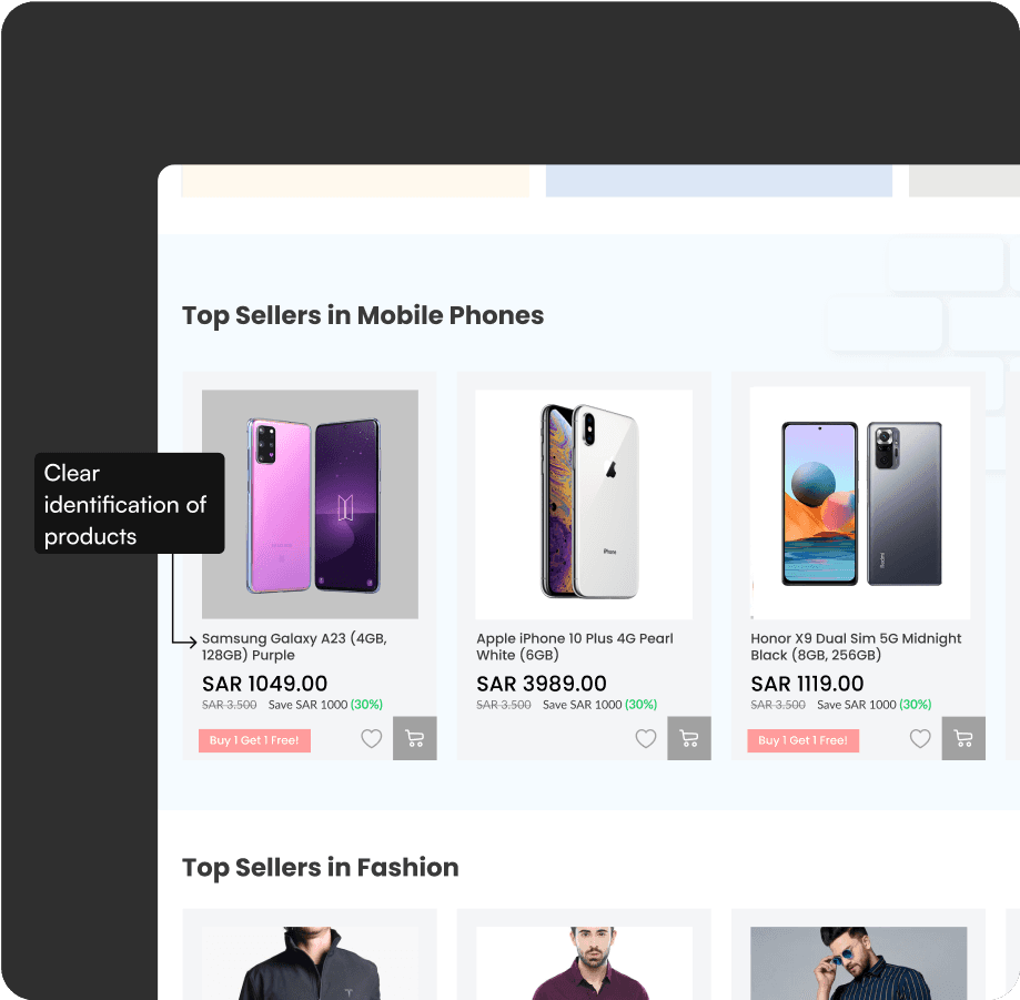
Clear identification of the product they are looking for through images and descriptive names.
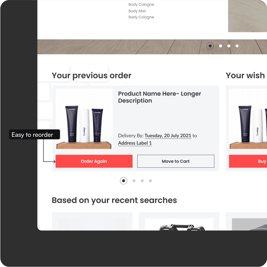
Easy access to previously purchased items for simple reorder.
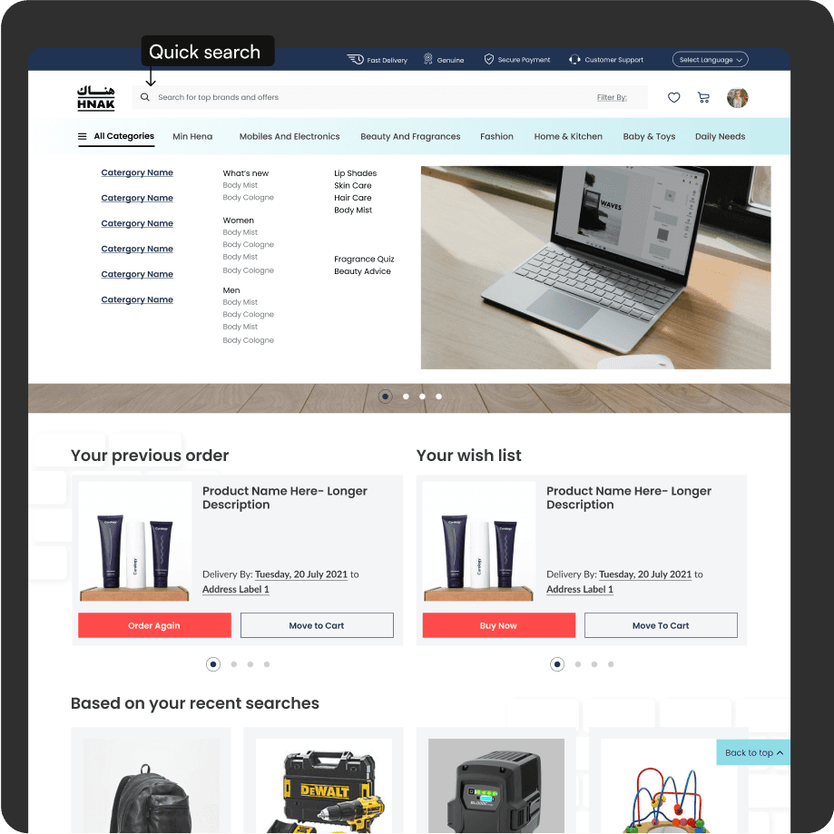
An effective search that makes it quick to locate the items of interest.
A streamlined checkout to get him in and out as quickly as possible.

One-Time Shoppers
Considerations in building this
Clear site navigation.
Complete product descriptions.
Clear and trustworthy company information.
Checkout without registration.

my learnings
Reflections after 3 months: Key takeaways from crafting experiences online and offline.
my learnings
E-COMMERCE CAN BE SO TRICKY!
Never has persona mapping and competitor research been more relevant than in HNAK. This was the first time we designed features that would target micro-behaviours of different types of personas.
Mapping out personas was so so important.
Product features had to be tailor-made for multiple different types of shoppers, which is a welcome change from other products where we typically only had to deal with one type of persona.
How to craft experiences online and offline.
The business side of this website played a very important role. We were tasked with specifically bridging the gap between online and offline shopping. This meant makes changes in the supply chain. For example, we introduced a feature that allowed shoppers to try clothes in a store near them before they make the purchase. This meant that the product was delivered not to a home, but a specific store.


