Softclay
Helping students make better career choices through gamification.
Summary
SoftClay developed an MVP (Minimum Viable Product) using a no-code platform to test functionality and assess market demand. Now, they aim to build a full-featured premium product for a larger market, requiring professional design to make it market-viable. This is where I come in to help them tackle this challenge.
Role
User Experience (UX) Researcher
Interaction (IxD) Designer
User Experience (UX) Designer
User Interface (UI) Designer
Timeline
2 months
skills
Product thinking
Interaction design
Market researcher
Visual design
tools
Figma
Miro
Notion
Illustrator
*Note
*This case study covers only parts of several months of design process focusing mainly on my role within the project. I have retracted or changed portions of findings to conceal any confidential information.
about SOFTCLAY
In a world teeming with possibilities, career decisions can be overwhelming for high school students.
SoftClay is an education technology mobile app that helps high school students (grades 8 to 12) explore different career paths and gain exposure to various professions. It offers a range of interactive features such as cards, bookings, points systems, and challenges, to assist students in identifying their ideal career path.
Project objective
Cohesive platform
To create a cohesive and intuitive user experience that effectively communicates the service offerings of the business to students.
Prior to delving into the application's design, understanding the existing structure was crucial, considering they already had a framework in place.
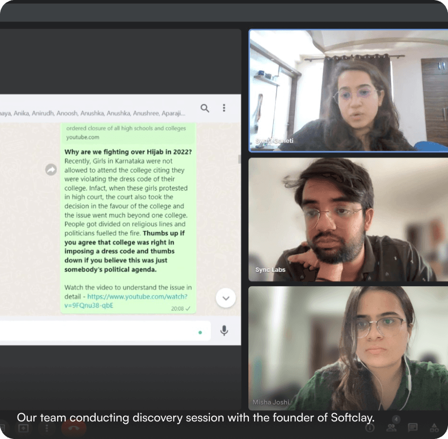
Facilitating user onboarding via telephonic calls and WhatsApp.
The Q&A session was conducted through a Google Deck presentation.
Communication conducted through WhatsApp groups lacking defined administrative roles and responsibilities.
Students were using a self evaluation method for their quizzes.
Identifying Challenges Faced
Reliance on traditional tools leading to system maintenance issues.
Utilization of disparate tools resulting in process inefficiencies.
No structure or incentive for users in place, hence there was a drop/stagnancy in the engagement rates of the product.
Difficult to measure retention on their current tools, and there were no tools in place to increase retention.
Understanding the users
It was crucial to understand the users who would be interacting with the platform on a day-to-day basis and consider their current behavioural patterns.
Focused driven (type AC).
Lacks Clarity (type BC).
Lacks interest (type AB).
Active seekers (type ABC).
project goal
How might we build a unified platform that allows high school students (Grades 8 and above) to explore and learn about different careers options using gamification principles, thus allowing them to make informed decisions about their future?
Information Architecture
This step was incredibly crucial to the entire design process, considering the abundance of data to display and numerous actions to perform. With a clutter-free interface in mind, the following architecture for the application was devised.

exploration of design trends
Exploring diverse visual styles to enhance the aesthetic appeal and user experience of the application.
As a designer, it was important to create the relevant experience to align with that intent. I studied the trending trends in the medium of application design to understand and narrowed down trends and practices which would align with the domain application that I was building.
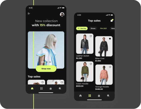
Asymmetric menus and galleries trend
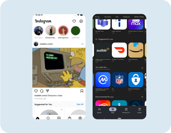
Multi directional navigation trend
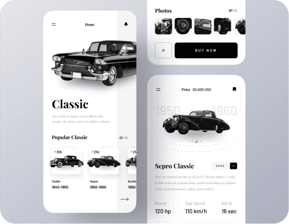
Limitless imagery trend
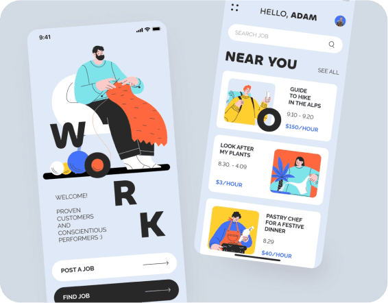
Unconventional text alignment trend

Borders define feature trend
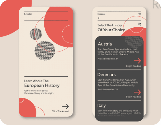
Abstract spherical patterns trend
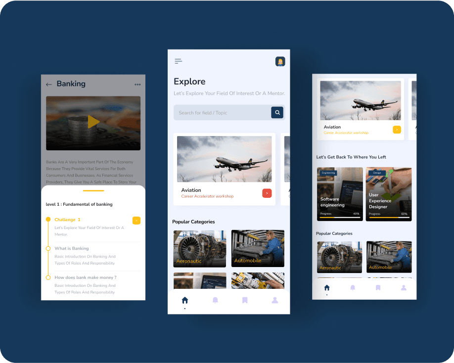
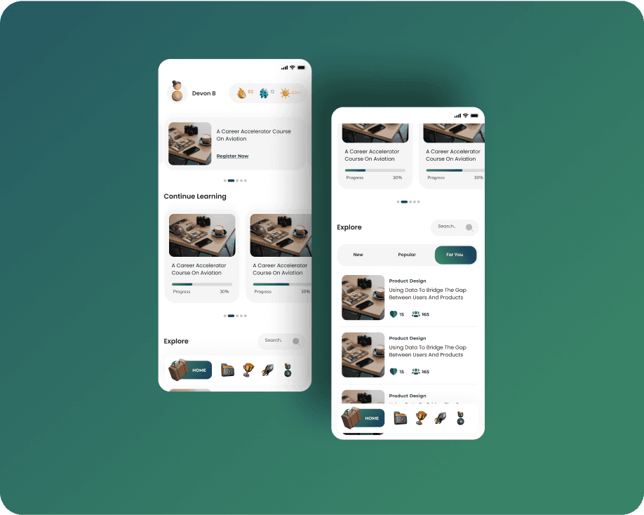
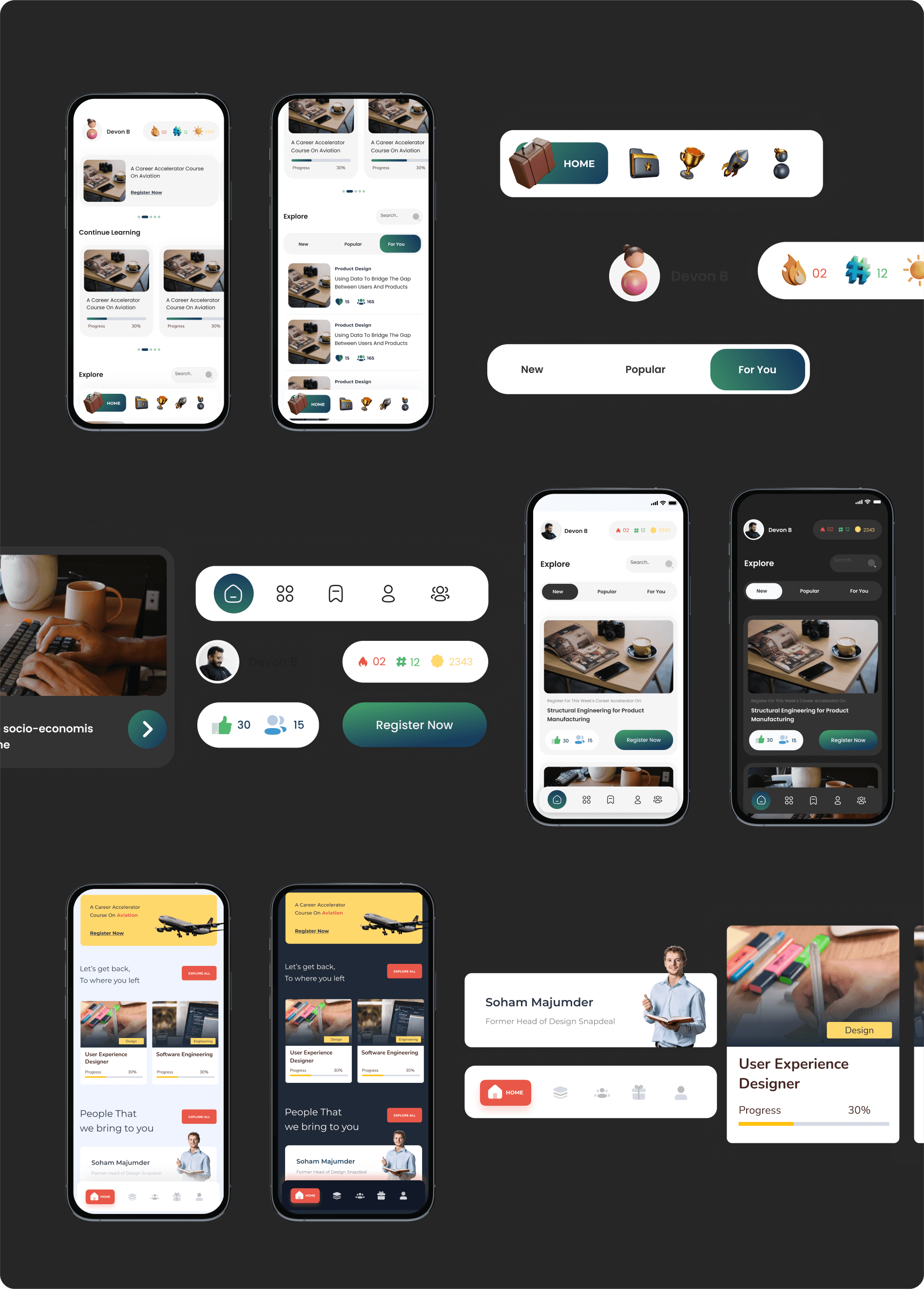
Visual Design Directions
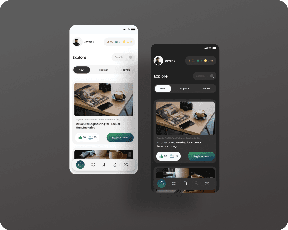
In our creative process, we meticulously explored various visual design directions, drawing inspiration from the latest trends in the industry. Through a thoughtful analysis, we curated a selection of compelling options, each showcasing unique aesthetics and potential impacts.
Subsequently, we presented these diverse design directions to our client, fostering a collaborative dialogue to ensure alignment with their vision and objectives. This iterative exploration allowed us to refine our approach, ensuring a visually stunning and strategically sound final product that resonates with contemporary design sensibilities.

Low Fidelity Wireframes
This step was incredibly crucial to the entire design process, considering the abundance of data to display and numerous actions to perform. With a clutter-free interface in mind, the following architecture for the application was devised.

Final overview
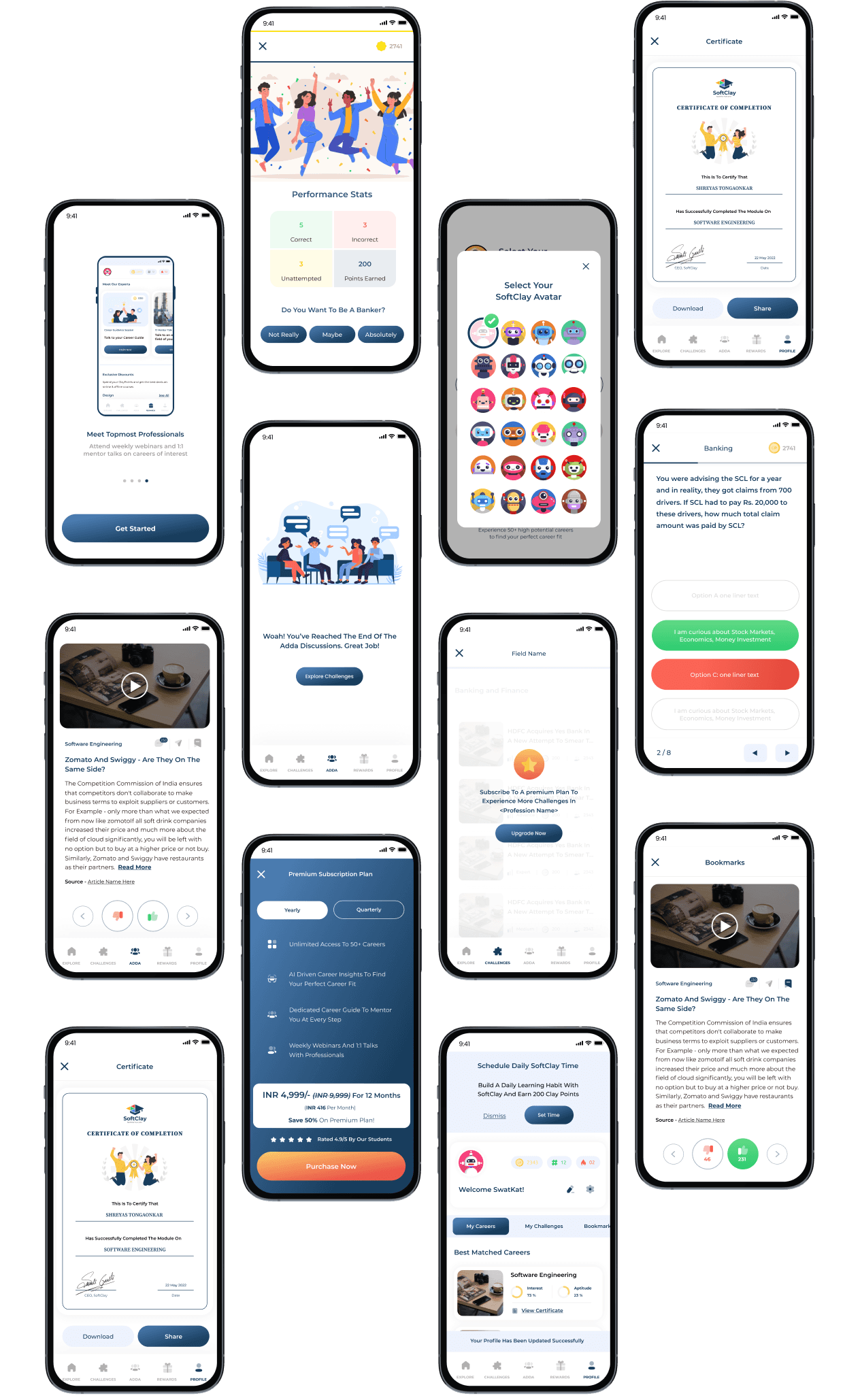
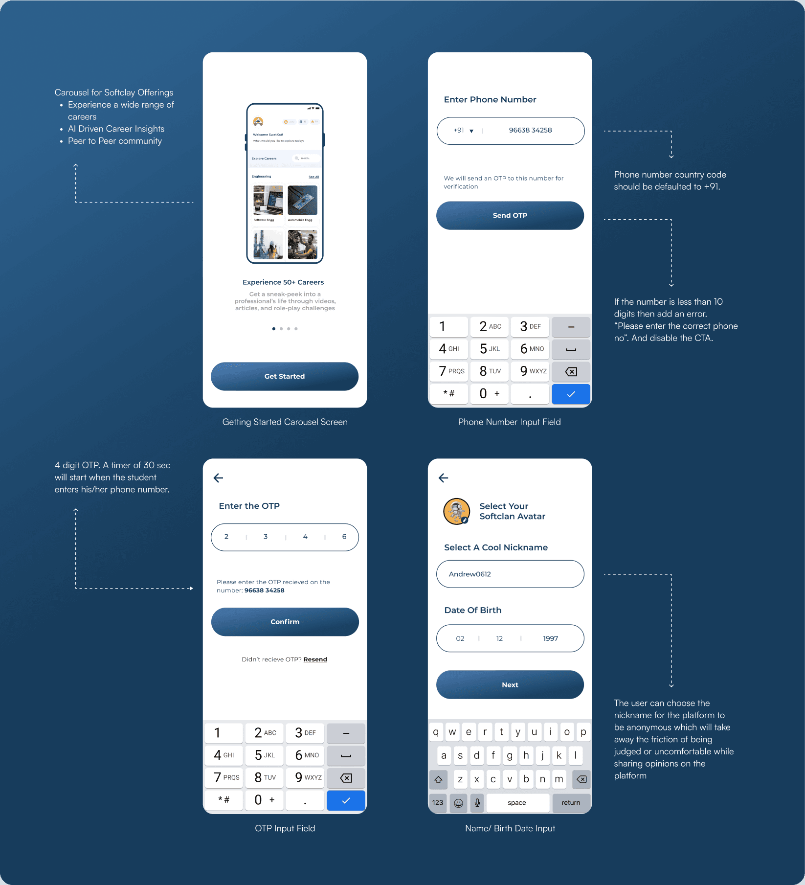
Onboarding Section
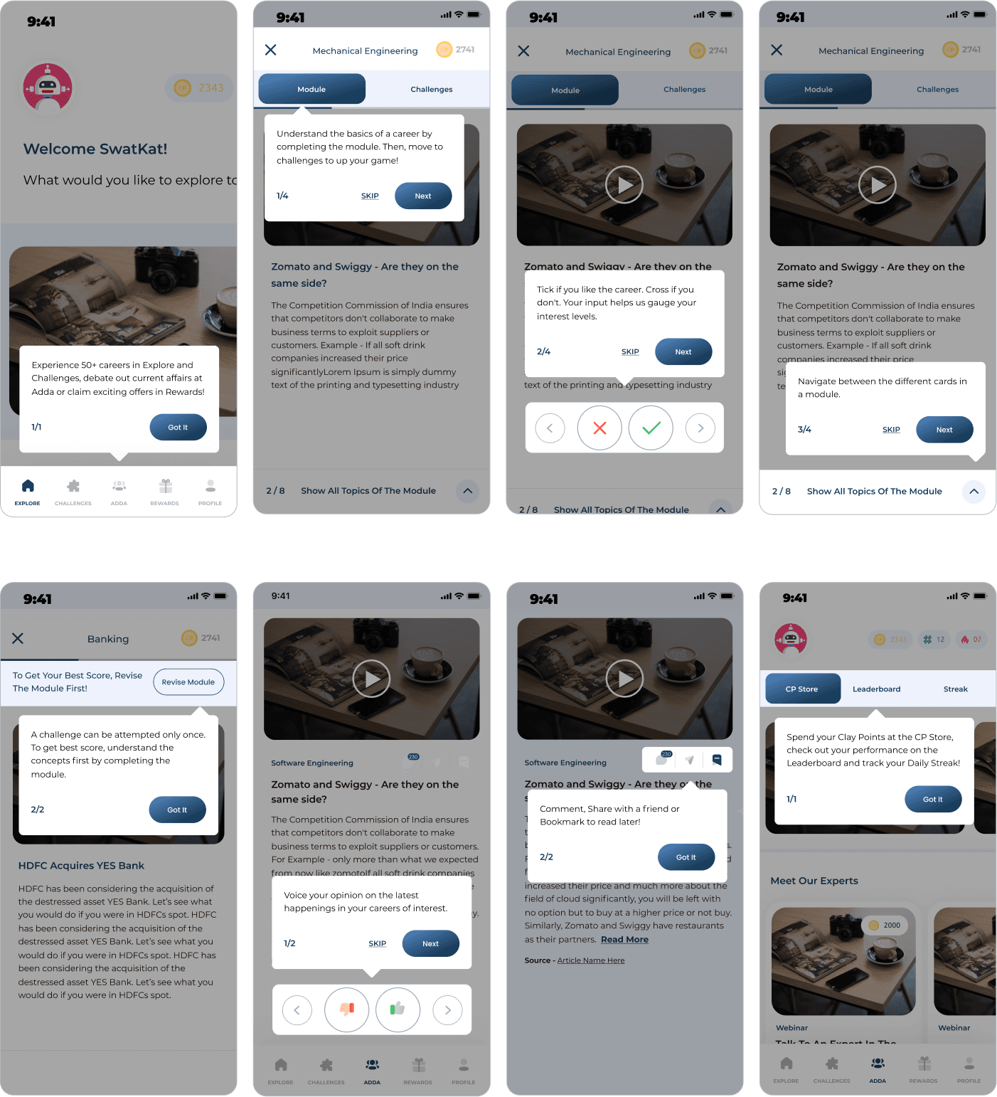
Tooltips Design
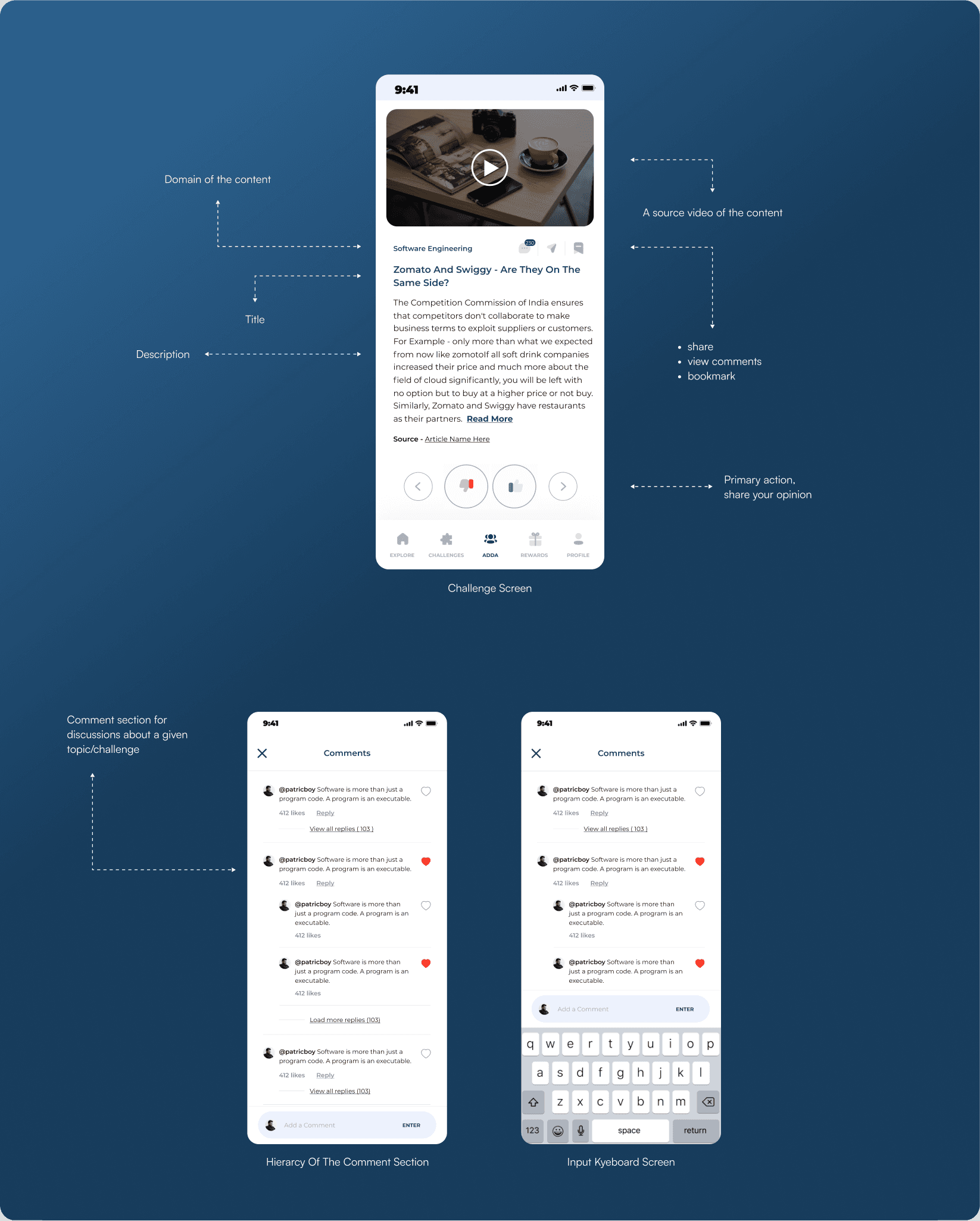
Challenges Section
Micro-interactions and animations
We built a series of micro-interactions and animations that would help enhance the MVP and add character to our design. These interactions were crucial in bringing our vision of using gamification principles to life.
my learnings
Reflections after 2 Months: Key takeaways from navigating tight deadlines and an even tighter budget.
my learnings
Beyond Aesthetics.
This project made me realise that everything that is aesthetics isn’t necessarily good for a product. I thought using 3D icons would be a fantastic way to appeal to young children and get them engaged with the application. Our development team had to step in and point out that the load time on a 3D icon would be too long and optimising such icons for shorter load times is no joke.
Keep it quick, keep it lean.
Working with this startup made me appreciate lean methodologies. Leveraging Figma prototypes for quick user tests and finding ways to creatively express ideas with limited resources is something that I learned on the go while working on this project.
Iterate Iterate Iterate.
Quick iteration was the only mantra to refine ideas continuously.


